I’m Eonbi Hong 홍은비, a product designer from South Korea. Currently, I’m pursuing my final year of MFA Interaction Design at the Umeå Institute of Design in Sweden.
I prefer to picture products from the back-end to the GUI level, so that I can have a deeper understanding of what I’m building. That’s why I define myself as a product designer rather than an interface or interaction designer. Recently, I’ve been into building products by coding with AI to gain more experience in front-end development and test different ideas.
I will continuously learn and move forward until the very end towards good, new things.
Education
MFA Interaction DesignUmeå Institute of Design, Sweden
Sep 2024–Present
Exchange program, Industrial designLinnaeus University, Sweden
Spring 2017
BFA Industrial Design BA PhilosophyKyungHee University, South Korea
2014–2020
Experience
Co-Founder & Founding DesignerWasabi Writing Club, South Korea
Mar 2024–Sep 2026
UX Design InternLaerdal Medical, Norway
Sep 2025–Feb 2026
Freelance UX DesignerDiscrete Label, South Korea
Mar–Dec 2023
UX Design InternNaver Corporation, South Korea
Nov–Dec 2021
Telehealth Patient Monitor Interface
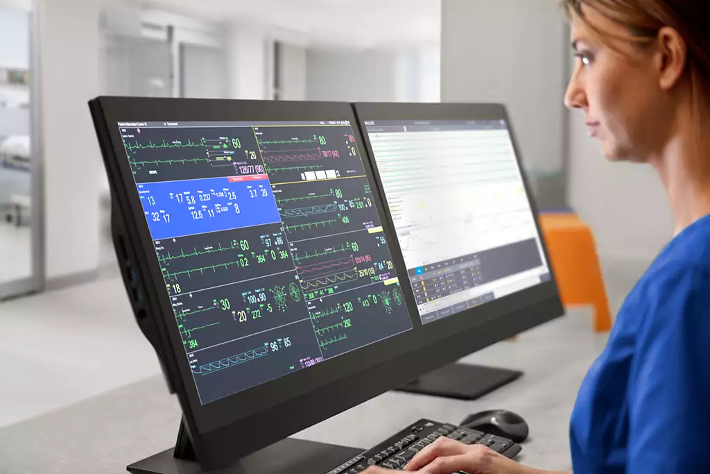
This project addresses the challenges of patient monitoring in telehealth environment, where a single telehealth nurse remotely oversees multiple patients. We focused on a telehealth nurse’s struggle where they cannot clearly know what is happening around the bedside and thereby cannot respond in time. The solution propose simple features with unique interface that address these issues and can be easily integrated into the existing monitor.
Team
Simon Ljungblahd
Natálie Švehlová
Eonbi Hong
Timeline and place
5 weeks, 2024
Umeå Institute of Design
Collaboration partner
Philips Healthcare
Project scope
Two most common events in hospitals.
In this project, we focused on two events that happen all the time. We aimed to address these two specific use cases with two simple features. But together, they show the remote nurse what the monitor alone cannot: what is actually happening at the bedside.
1Saturation probe falling off a patient
Problem
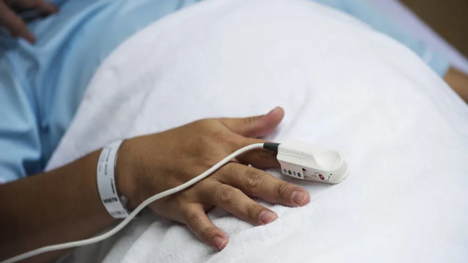
The saturation probe, the small sensor that reads a patient's blood oxygen, slips off often. Each time it does, a technical alarm goes off. The alarm itself isn't the danger. The danger is the gap: while saturation isn't being measured, something serious could happen unnoticed. So when the alarm sounds, the remote nurse has questions. Is anyone at the bedside? Is someone on their way? Do I need to call the ward?
Solution
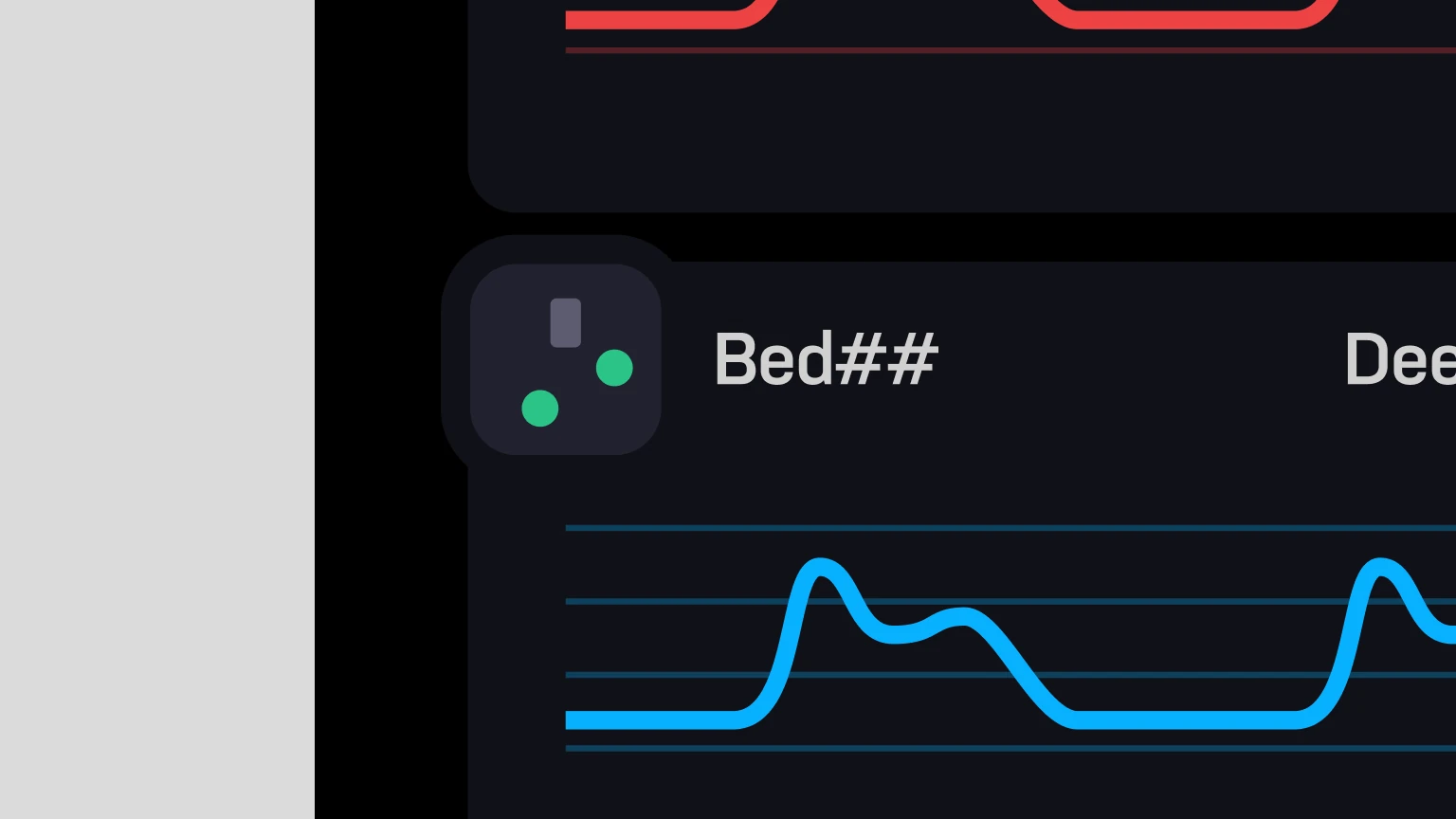
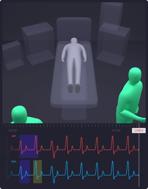
Our approach to address this problem quickly and effectively is to add a small visual indicator called a 'Mini Map,' which allows nurses to glance at the bedside and see if there're any nurses near by the patient. Then we made the Mini map act as a button that opens a new window called 'Focus View.' Focus view contains a video feed showing two important pieces of information: the location and body position of the nurses. The telehealth nurse can switch between the two views using mouse scrolling.
1Mini map
2Focus view
How it works
Show moreShow less
When the technical alarm goes off, the telehealth nurse first checks the Mini Map to see whether anyone is near the patient. Since there's currently no one by the bedside, they can click the Mini Map to open Focus View. They then zoom out until they see the nearest bedside nurse in the ward. If no one is coming, the telehealth nurse can quickly decide to inform the ward. In this case, the telehealth nurse can see that a bedside nurse is approaching the patient, so they zoom in again and check the bedside nurse's body position to make sure that they have fixed the probe.
2Unusual dips found in ABP graph
Problem
An unusual dip in the ABP graph often means something ordinary: a bedside nurse taking a blood sample. But from a distance, the graph only shows that something happened, not what. To know, the nurse has to go back to that exact moment.
Solution
To address this problem, we let them see the moment itself. In Focus View, the parameter graph sits directly below the video feed. Click any point on the graph, and the footage jumps to the bedside at that exact time.
How it works
Show moreShow less
When the telehealth nurse notices an unusual dip on the ABP graph, they open Focus View to review the video footage. Since the ABP parameter (red) needs to be examined, the parameter is selected to display its graph below the video feed. A live view appears first, and once a specific time frame is selected, the video footage at that exact moment is shown. In this case, it becomes clear that a bedside nurse is taking a blood sample from the patient.
Design system
Project design system for consistency
While we were working on the prototype, we made a simple design system to keep consistency and to make the prototype easily understandable.
Animation made by Simon Ljungblahd
Story around the process
More to tell about what we’ve tried, failed and evaluated
There's much more behind why it looks this way: the attempts, the failures, and the evaluations that shaped each decision. If you're curious, I'd love to tell you more. Please reach out.
Behind the scene
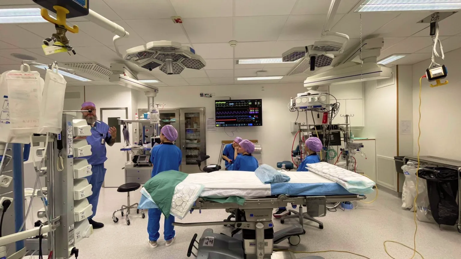
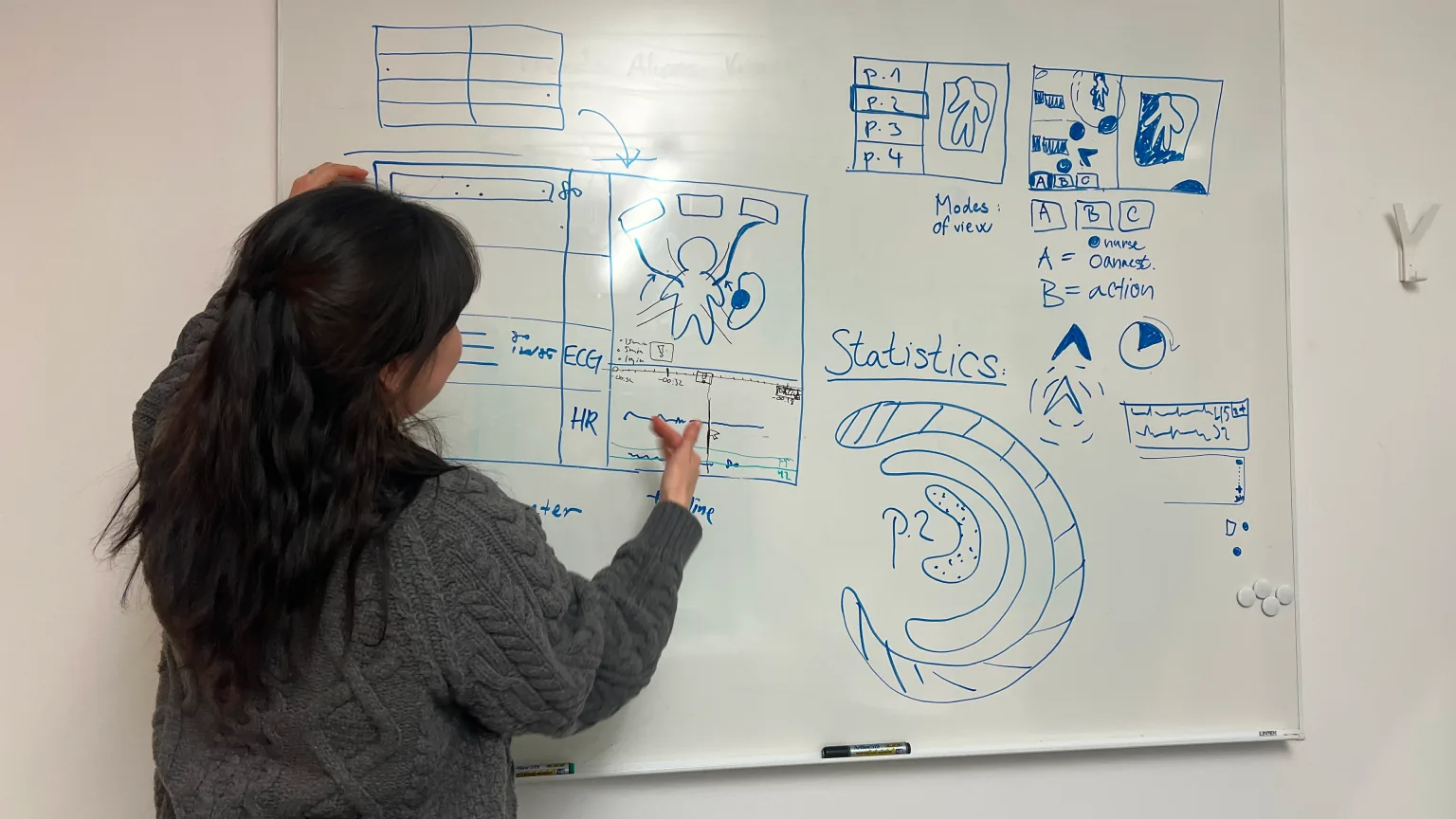
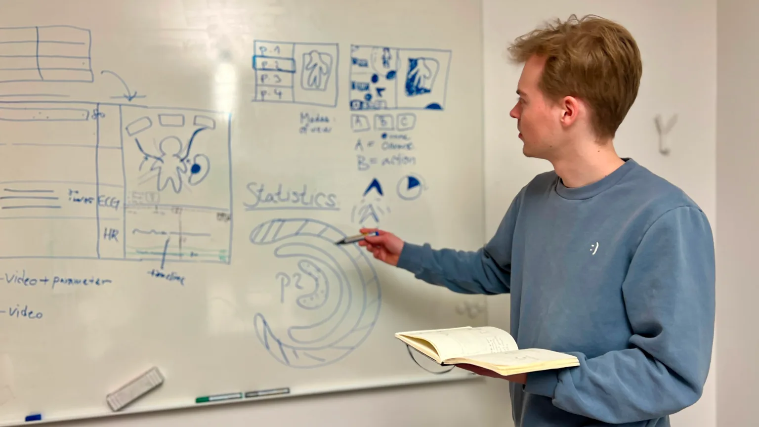
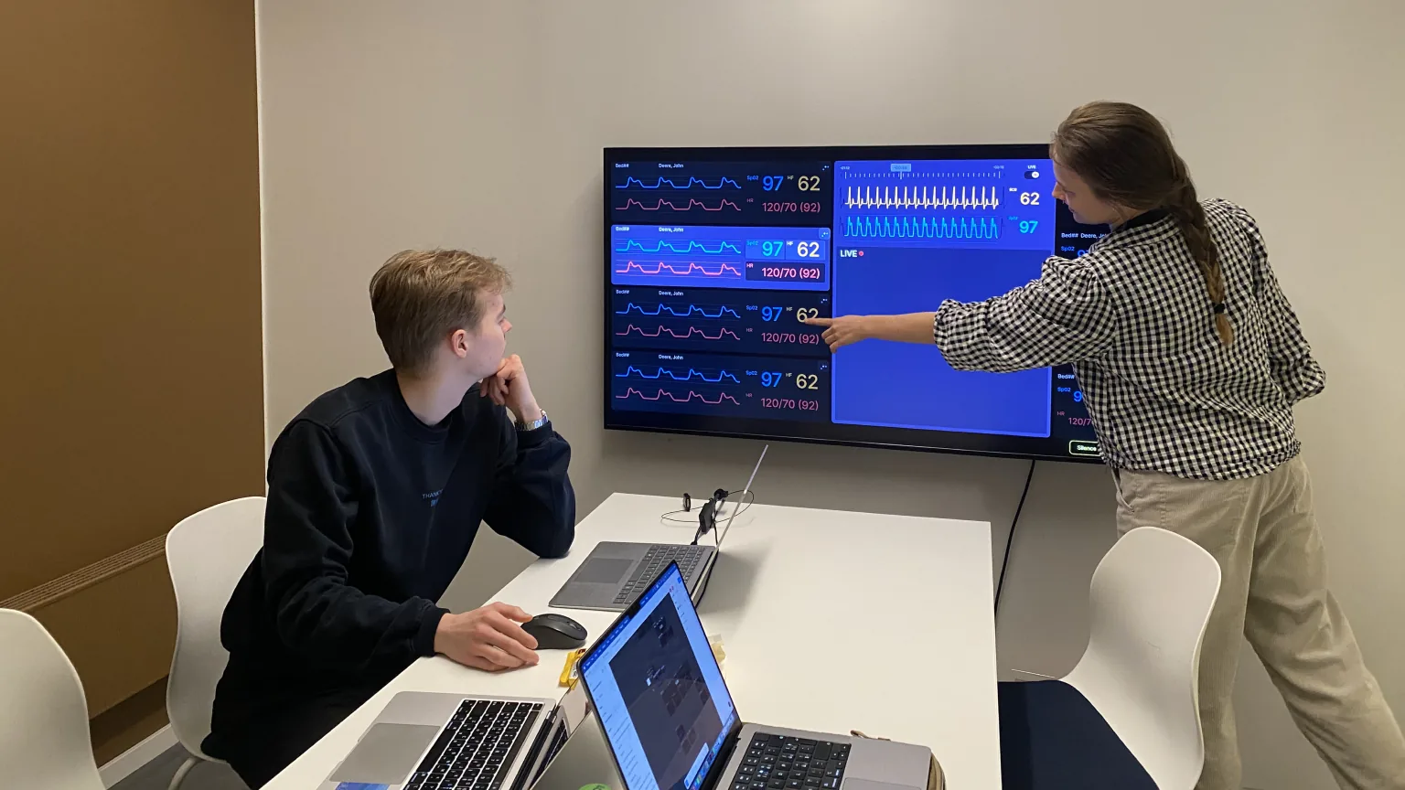
Field trip to hospital and lots of group work
Reflection
Prototype, test and let people see it
This project let me step into the world of healthcare design. Huge thanks to Leon Andersen and the medical staff at NUS for sharing their knowledge and experience. Most importantly, I want to give my deepest appreciation and respect to my great team, Simon and Natálie for amazing work and that they made five intense weeks a joy. From this project, I learned to get out of my head and build: quickly, so we could test and evaluate. I practiced presenting ideas clearly enough that people could see the benefits for themselves. I believe I came out of these five weeks a better designer, in how I reason, prototype, test, and evaluate.
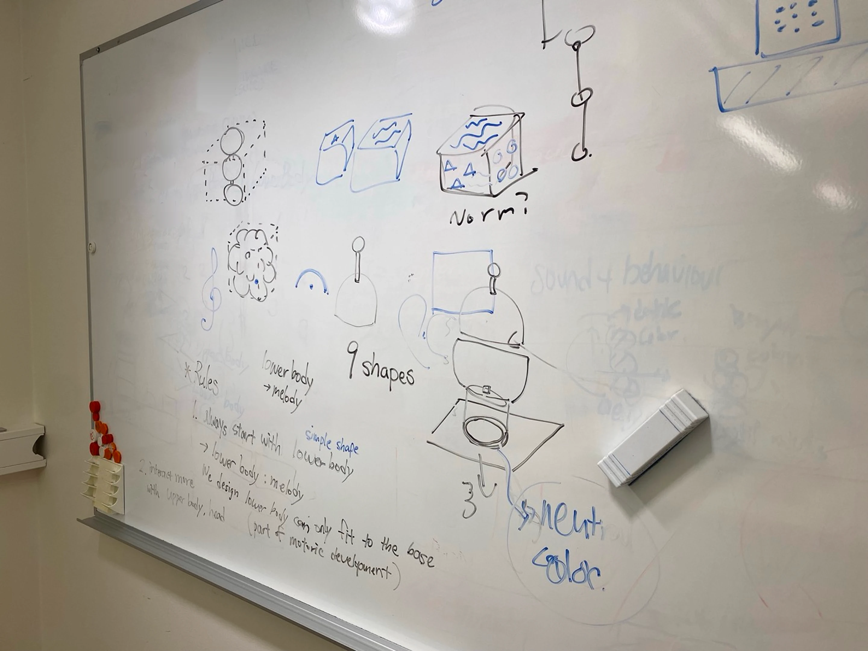
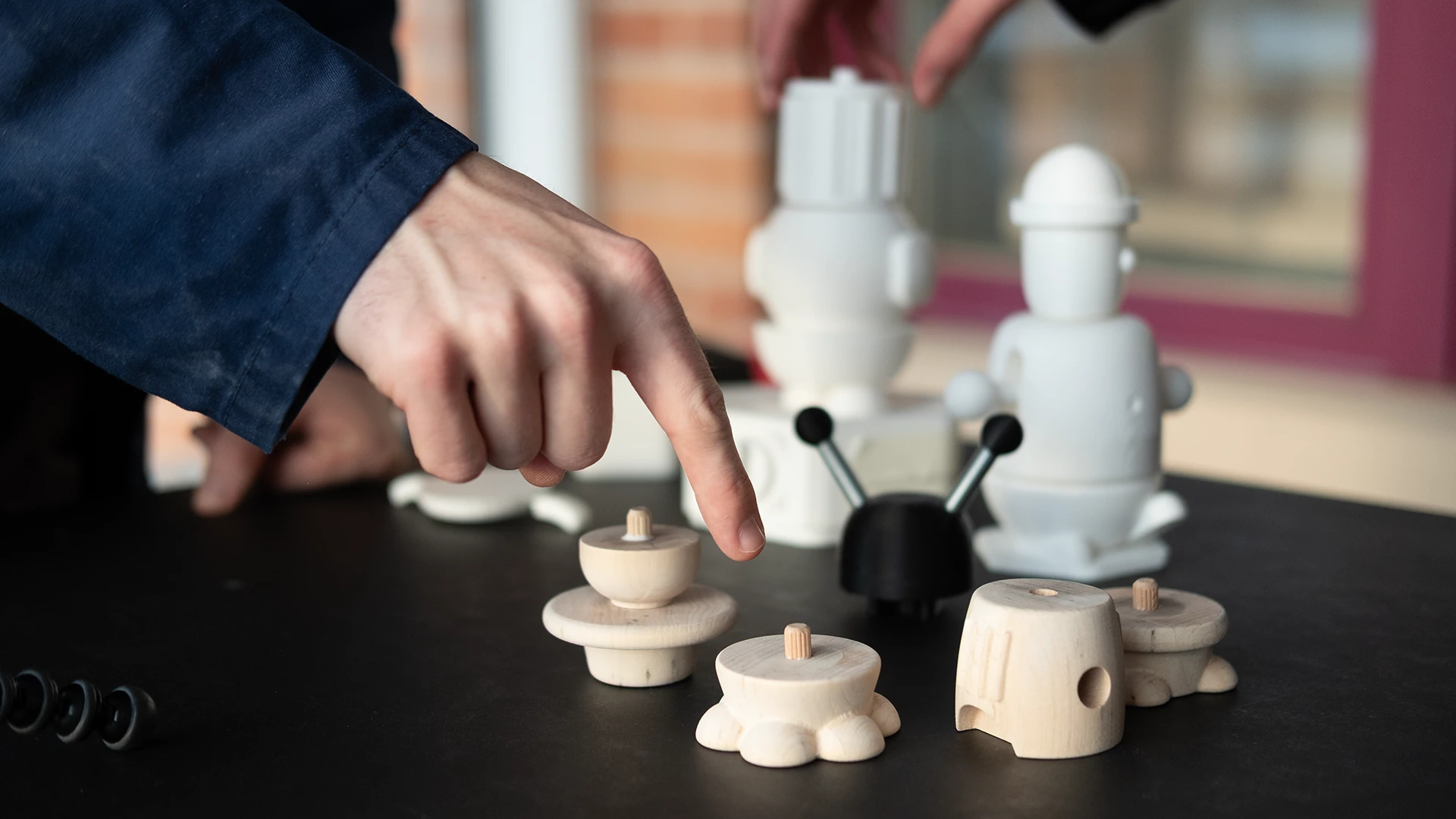
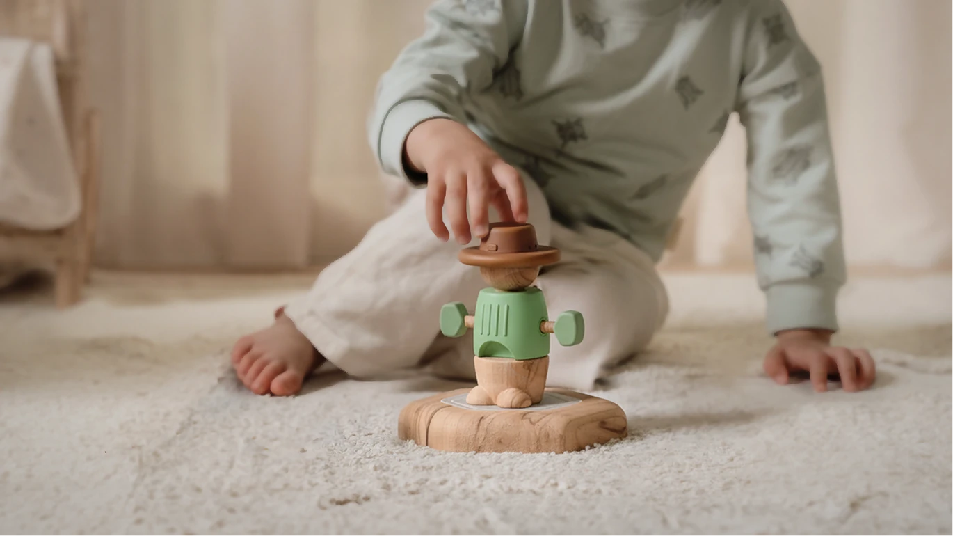
Soundlings is a toy that answers back. Made for children aged 3 to 5, it turns touch into sound. Each part plays a different role: a melody, an instrument, or a sound effect. So the more a child places, tweaks, and plays, the more there is to hear. And while they play, they are building muscle control and fine motor skills.
Modelling and rendering by Thorben Westendorf, Chenyu Dong and Cheolhun Cheon
Form
Three parts of soundlings
Soundlings has three main parts, each with its own job. The leg carries the melody, the body sets the instrument, and the head adds sound effects. They all sit on a base that works as a speaker.
Interaction points
Different interactions for each modules
Each module asks for a different kind of interaction, so each one works a different motor skill.
PressingTwistingPushingRotatingRollingBending
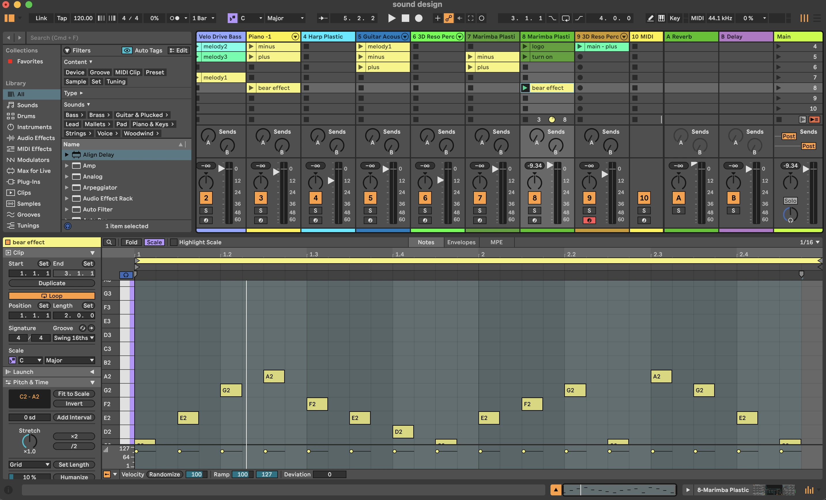
Sound design
Sound design and video editing by Eonbi Hong
Basic sounds
Operational sounds
There are five operational sounds: power on, power off, volume up, volume down, and connection. With 30 melodic sounds already in the toy, these needed to stay out of the way. So we set one rule: a single tone each. Simple and clean.
1Power on/off
2Volume up/down
3Connection feedback
Melody
Leg: Three basic melodies
Each leg module holds a different melody. Placing a leg on the base wakes Soundlings up, so the melody is where every song begins.
Instrument sound
Body: Change instrument sound
Each body modules have its own instrument: piano, guitar, and drum(marimba).
Interaction point
Arm movement: Changes in melody
Tweak the arms, and notes are added or taken away. One simple rule, many variations.
Sound effect
Head: Adding sound effects
Each head module carries 2–3 sound effects around its own theme. The rule here: every sound should be different, but every sound in a theme should feel like it belongs together.
Harmonised sound
How it all combine into one harmonised sound
We aimed for harmony from the very beginning. Shared melodic rules and instruments with similar tones mean that different sounds blend smoothly.
Behind the scene
Modeling, prototyping, filming and user-testing
Reflection
Designing sound, interaction and form together
I enjoyed designing sound and interaction around a physical form. It made me think about how powerful sound can be in shaping an experience. Working with people who saw the product and its users differently taught me something else: how to find balance, how to communicate my ideas more clearly, and how to understand viewpoints that aren't my own.
Two mini-projects exploring physical prototyping through coding and electronics.
Tools
HTML / CSS / Java Script
Adafruit Feather nRF52840
Input / Output sensors
Time and Place
1.5 weeks, 2026
Umeå Institute of Design
1Microwave availability panel
Project Info
3 days mini-project, Simon Ljungblahd & Eonbi Hong
About
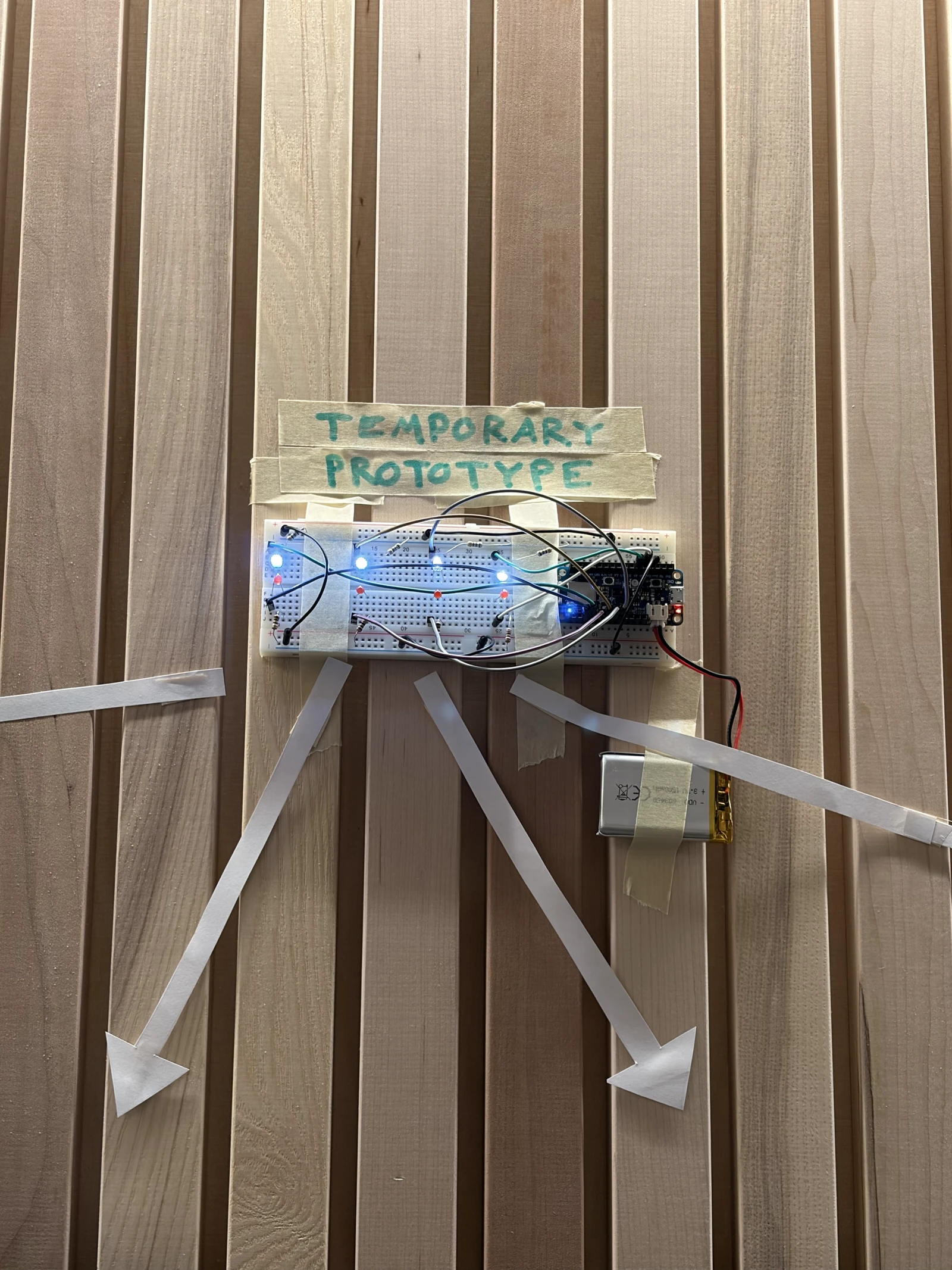
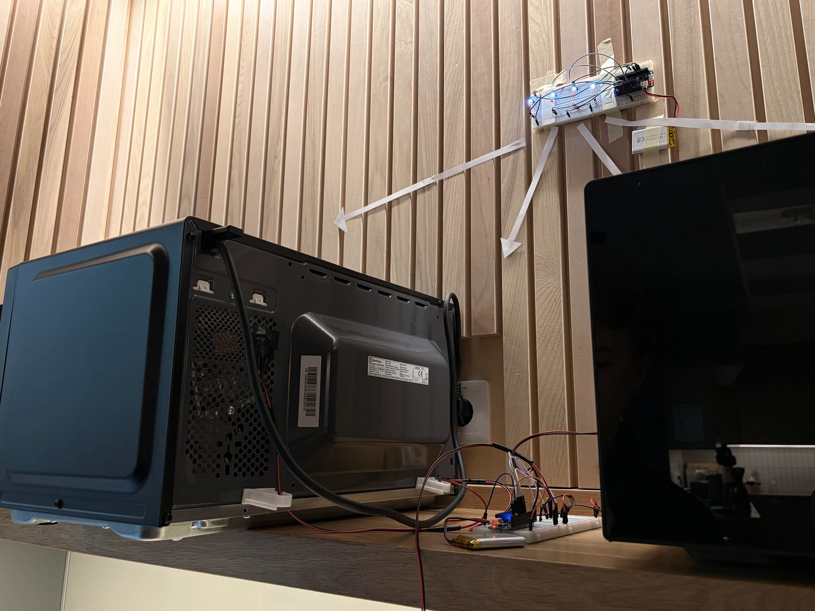
This simple prototype is an LED panel that shows at a glance whether the microwave in the school's student kitchen is free. When the microwave is open and while it runs, LDR photosensors sense the light inside it and send the value to an LED, which turns on the red light. When the microwave is off, the red light goes off and the white light comes back on.
Input sensor
LDR photosensor
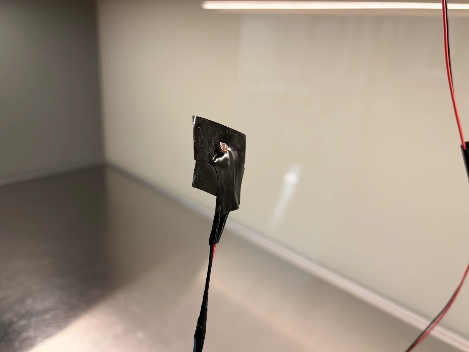
As we kept examining the microwave, we found that a light always comes on inside when the door is opened and while it is running. The LDR photosensor became very reliable once its values were calibrated which made it an effective solution.
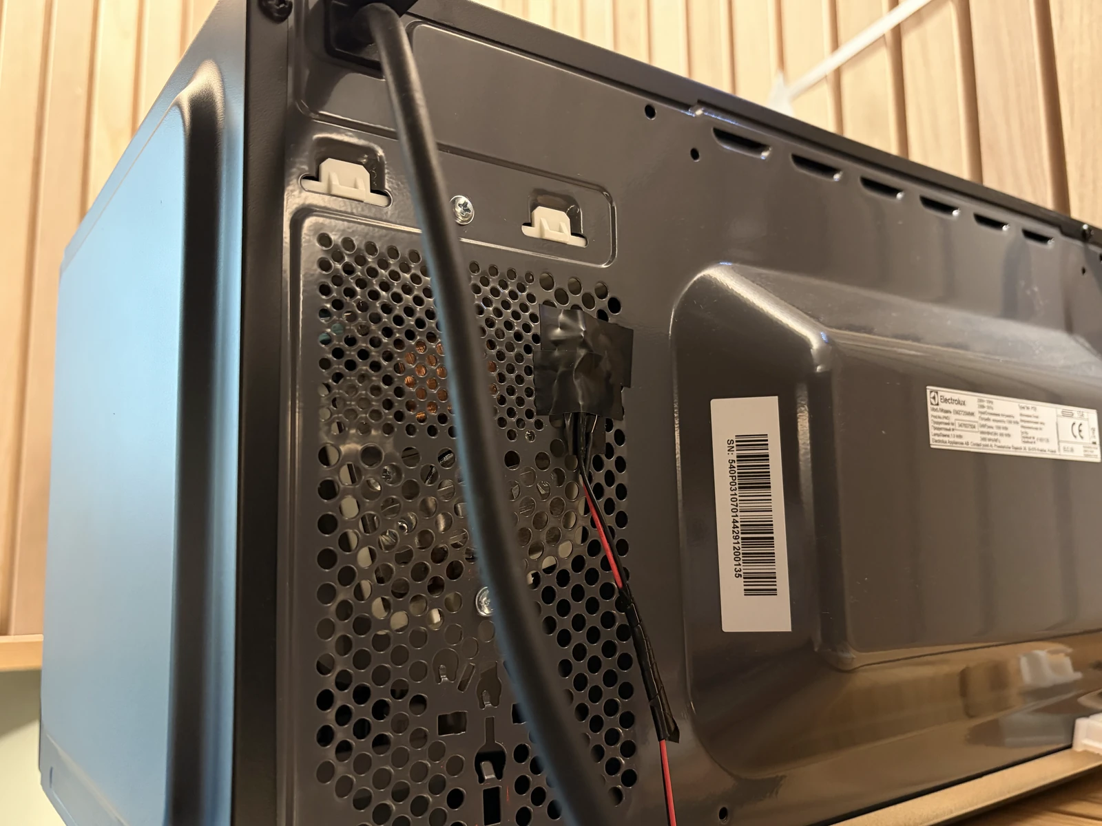
LDR photosensor A photosensor attached on the back of the microwave.
Code
Calibrating values
Because the room-light in the kitchen changes constantly during the day, we built a baseline by averaging the readings the four sensors take continuously. We then shone light on them to confirm that the values responded reliably, and set the threshold.
Code
The code behind the panel
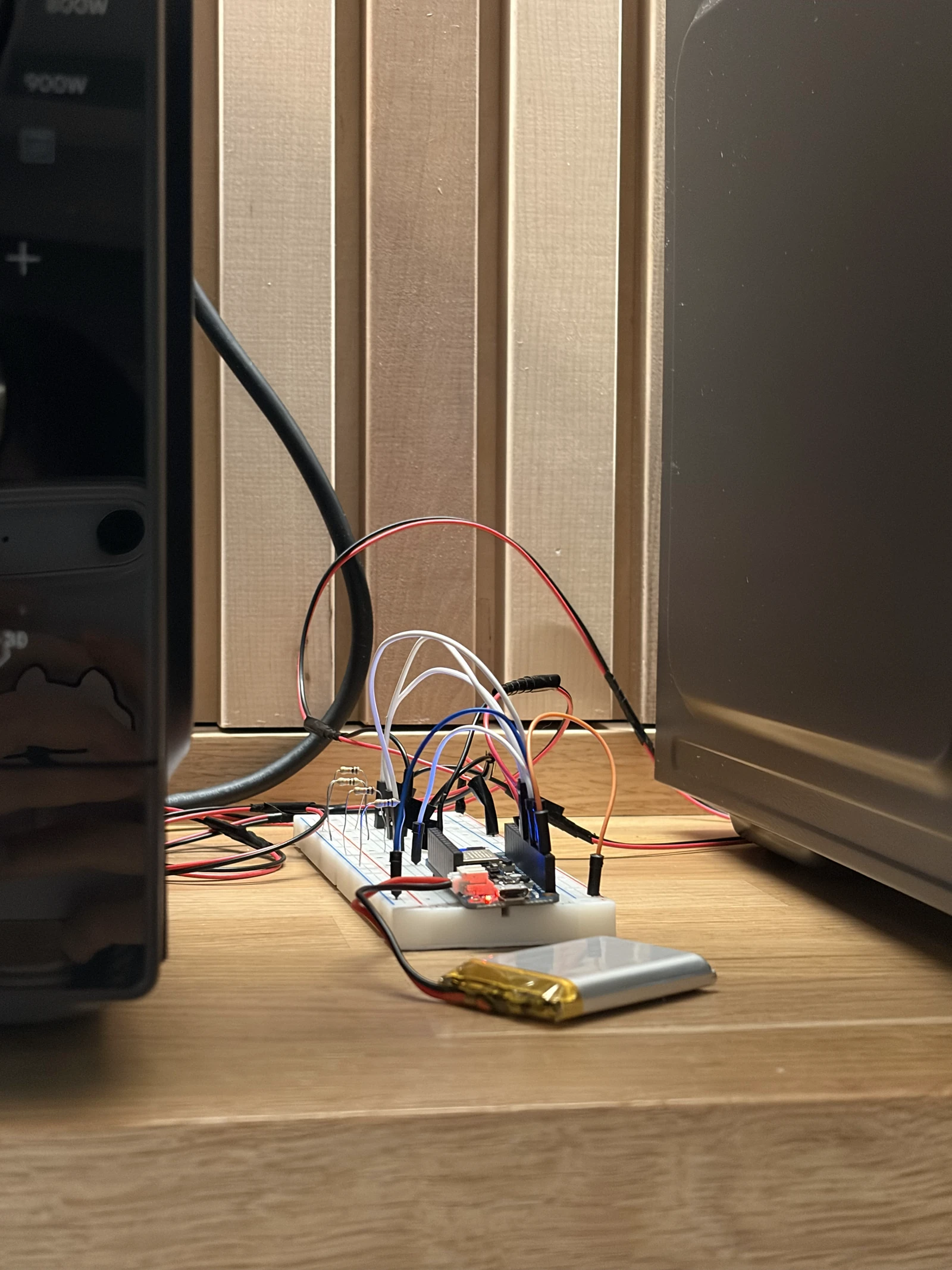
This project uses two Arduinos: one connected to the sensor board, the other to the LED board. Each Arduino connects to a browser over Bluetooth, where an HTML page receives the state the sensor board detects and sends it to the LED board.
Sensor board
// ============================================================================// SENSOR BOARD - Feather nRF52840 Sense// Four LDRs on A0, A1, A4, A5. Detects when a light switches on, and reports// state over BLE (Nordic UART) to a browser page, which relays it to a second// Feather driving the LEDs.//// Advertises as: microwave_sensor//// Messages sent:// S:1010 state, one char per sensor, 1 = triggered. On change + every 2 s.// D:12.3,4.5,30.1,2.0 deltas, 5 times a second, for the browser display.// T:0,15.0,7.0 thresholds for one sensor. On connect + after a change.//// Messages accepted:// C:0,20,9 set sensor 0 to ON above 20, OFF below 9// C:*,20,9 set all four at once// Changes live in RAM and reset on power cycle - once you settle on values,// put them in ON_DEFAULT / OFF_DEFAULT below.// ============================================================================#include <bluefruit.h>// ---------- serial output mode (USB debugging, independent of BLE) ----------// 0 = TEXT : labelled numbers for every sensor, for the Serial MONITOR// 1 = PLOT_RAW : the smoothed signal of every sensor// 2 = PLOT_DET : delta of every sensor + the trigger line// 3 = PLOT_ONE : one sensor in detail (delta, both thresholds, state)// 4 = QUIET : only BLE events, so the monitor stays readable#define OUTPUT_MODE 4#define FOCUS_SENSOR 0 // which sensor PLOT_ONE shows (index, not pin)// ---------------------------------------------------------------------------// ---------- tuning knobs ----------// SAMPLES trades noise for speed: each one costs ~200 us, and four sensors pay// it four times. 16 was generous - 8 still averages away the jitter while// roughly halving the time round the loop.const int SAMPLES = 8; // hardware oversampling per readingconst float SIGNAL_A = 0.20; // fast smoothing (bigger = snappier, noisier)const float BASELINE_A = 0.001; // slow drift (smaller = slower baseline)const int CONFIRM = 3; // consecutive samples needed to switch stateconst float ON_DEFAULT = 15.0;const float OFF_DEFAULT = 7.0;// ----------------------------------// ---------- BLE send rates ----------const unsigned long HEARTBEAT_MS = 2000; // resend state even if unchangedconst unsigned long TELEMETRY_MS = 100; // deltas, 10 per second// State changes are sent the instant they happen regardless of this - the rate// below only governs the numbers feeding the browser's graph.//// How low can TELEMETRY_MS go? The limit is the BLE connection interval, which// is the heartbeat of the radio link: the two devices only exchange packets on// that tick, so nothing can arrive faster than it, no matter how often we call// print(). We ask for 15-30 ms below, so ~30-60 messages/sec is the ceiling.// 100 ms (10/s) comfortable, the default// 50 ms (20/s) usually fine, close to the ceiling// 25 ms (40/s) will queue up and go laggy - past the point of diminishing// returns anyway, since your eye can't read 40 updates/sec// ------------------------------------struct Sensor { uint8_t pin; const char* name; float onDelta; // rise above baseline that counts as "light on" float offDelta; // must fall back below this to count as "off" float signalVal; // fast-smoothed reading float baseline; // slow-drifting reference bool on; int confirm; float dMin, dMax; // delta range since the last text report};Sensor sensors[] = { { A0, "A0", ON_DEFAULT, OFF_DEFAULT, 0, 0, false, 0, 9999, -9999 }, { A1, "A1", ON_DEFAULT, OFF_DEFAULT, 0, 0, false, 0, 9999, -9999 }, { A4, "A4", ON_DEFAULT, OFF_DEFAULT, 0, 0, false, 0, 9999, -9999 }, { A5, "A5", ON_DEFAULT, OFF_DEFAULT, 0, 0, false, 0, 9999, -9999 },};const int N = sizeof(sensors) / sizeof(sensors[0]);BLEUart bleuart;unsigned long lastReport = 0;unsigned long lastHeartbeat = 0;unsigned long lastTelemetry = 0;char lastSentState[N + 1] = "";// Incoming BLE data arrives in chunks, not lines, so we accumulate until a// newline before acting - the same framing the browser does in the other// direction.char rxBuf[64];uint8_t rxLen = 0;// Set when a browser connects; the loop sends the thresholds a moment later.// Sending from inside the callback itself is too early - the link isn't ready// for notifications yet and the message is silently dropped.unsigned long announceAt = 0;// ============================================================================// Sensing// ============================================================================// Trimmed mean: average of SAMPLES reads with the highest and lowest thrown// away. The averaging kills fine grain noise, the trimming kills spikes.// The first read is discarded because the ADC needs a moment to settle after// switching channels - without it, sensors bleed into each other.int readFiltered(uint8_t pin) { analogRead(pin); delayMicroseconds(300); int first = analogRead(pin); long sum = first; int mn = first, mx = first; for (int i = 1; i < SAMPLES; i++) { int v = analogRead(pin); sum += v; if (v < mn) mn = v; if (v > mx) mx = v; delayMicroseconds(200); } return (sum - mn - mx) / (SAMPLES - 2);}// Runs the whole filter + detection chain for one sensor, returns its delta.float updateSensor(Sensor &x) { int raw = readFiltered(x.pin); x.signalVal = SIGNAL_A * raw + (1 - SIGNAL_A) * x.signalVal; float delta = x.signalVal - x.baseline; if (delta < x.dMin) x.dMin = delta; if (delta > x.dMax) x.dMax = delta; // Hysteresis + confirmation: two different thresholds, and the signal has to // stay past one for CONFIRM samples in a row before the state flips. if (!x.on) { x.confirm = (delta > x.onDelta) ? x.confirm + 1 : 0; if (x.confirm >= CONFIRM) { x.on = true; x.confirm = 0; } } else { x.confirm = (delta < x.offDelta) ? x.confirm + 1 : 0; if (x.confirm >= CONFIRM) { x.on = false; x.confirm = 0; } } // The baseline only drifts while this sensor reads "off", so a long "on" // period can never be absorbed into the baseline and lost. if (!x.on) { x.baseline = BASELINE_A * x.signalVal + (1 - BASELINE_A) * x.baseline; } return delta;}// ============================================================================// BLE// ============================================================================// Report every sensor's thresholds. The browser treats these as the truth and// updates its fields to match, so what you see there is always what the board// is actually using - not what you last typed.void sendThresholds() { for (int s = 0; s < N; s++) { bleuart.print("T:"); bleuart.print(s); bleuart.print(","); bleuart.print(sensors[s].onDelta, 1); bleuart.print(","); bleuart.print(sensors[s].offDelta, 1); bleuart.print("\n"); delay(5); // let each notification go out before the next }}// Handles one complete line from the browser, newline already stripped.// C:0,20,9 one sensor// C:*,20,9 all of themvoid handleCommand(const char* line) { if (line[0] != 'C' || line[1] != ':') return; const char* p = line + 2; const char* c1 = strchr(p, ','); if (!c1) return; const char* c2 = strchr(c1 + 1, ','); if (!c2) return; float on = atof(c1 + 1); float off = atof(c2 + 1); // The gap between the two is the hysteresis - it is what stops the output // chattering when the signal sits right at the trigger point. Refuse rather // than silently accept a pair that would remove it. if (on <= 0 || off >= on) { Serial.println("rejected: need OFF below ON, and ON above 0"); sendThresholds(); // put the browser back in step return; } if (p[0] == '*') { for (int s = 0; s < N; s++) { sensors[s].onDelta = on; sensors[s].offDelta = off; } Serial.print("all sensors -> ON "); } else { int i = p[0] - '0'; if (i < 0 || i >= N) return; sensors[i].onDelta = on; sensors[i].offDelta = off; Serial.print(sensors[i].name); Serial.print(" -> ON "); } Serial.print(on); Serial.print(" / OFF "); Serial.println(off); sendThresholds();}void readCommands() { while (bleuart.available()) { char c = (char) bleuart.read(); if (c == '\n' || c == '\r') { if (rxLen > 0) { rxBuf[rxLen] = '\0'; handleCommand(rxBuf); rxLen = 0; } } else if (rxLen < sizeof(rxBuf) - 1) { rxBuf[rxLen++] = c; } else { rxLen = 0; // overlong garbage, throw it away and resync } }}void connectCallback(uint16_t handle) { (void) handle; Serial.println("BLE: browser connected"); digitalWrite(LED_BUILTIN, HIGH); lastSentState[0] = '\0'; // force a fresh state send to the new listener rxLen = 0; announceAt = millis() + 500; // send thresholds once the link has settled}void disconnectCallback(uint16_t handle, uint8_t reason) { (void) handle; (void) reason; Serial.println("BLE: browser disconnected"); digitalWrite(LED_BUILTIN, LOW);}void startBLE() { // Ask the softdevice for the high-throughput configuration (bigger MTU, more // queued notifications). Must come BEFORE begin() - it sizes buffers that // begin() allocates. Bluefruit.configPrphBandwidth(BANDWIDTH_MAX); Bluefruit.begin(); Bluefruit.setTxPower(4); // Connection interval in units of 1.25 ms, so this asks for 15-30 ms. That // is the tick the radio actually exchanges data on, and therefore the floor // on how fresh the browser's numbers can be. Apple's guidelines don't allow // shorter than 15 ms, so asking for less just gets refused. Bluefruit.Periph.setConnInterval(12, 24); Bluefruit.setName("microwave_sensor"); Bluefruit.Periph.setConnectCallback(connectCallback); Bluefruit.Periph.setDisconnectCallback(disconnectCallback); bleuart.begin(); Bluefruit.Advertising.addFlags(BLE_GAP_ADV_FLAGS_LE_ONLY_GENERAL_DISC_MODE); Bluefruit.Advertising.addTxPower(); Bluefruit.Advertising.addService(bleuart); Bluefruit.ScanResponse.addName(); Bluefruit.Advertising.restartOnDisconnect(true); Bluefruit.Advertising.setInterval(32, 244); Bluefruit.Advertising.setFastTimeout(30); Bluefruit.Advertising.start(0); // 0 = advertise forever Serial.println("BLE: advertising as microwave_sensor");}// ============================================================================void setup() { Serial.begin(115200); // Note: no `while (!Serial)` here. That would stall the board forever when it // runs on battery with no USB host attached. delay(500); pinMode(LED_BUILTIN, OUTPUT); analogReadResolution(12); // 0-4095 instead of 0-1023: 4x more headroom // Seed every filter so we don't spend the first seconds ramping up from zero. // Make sure the lights you want to detect are OFF while this runs. for (int s = 0; s < N; s++) { sensors[s].signalVal = sensors[s].baseline = readFiltered(sensors[s].pin); } for (int i = 0; i < 100; i++) { for (int s = 0; s < N; s++) { Sensor &x = sensors[s]; x.signalVal = SIGNAL_A * readFiltered(x.pin) + (1 - SIGNAL_A) * x.signalVal; } delay(5); } for (int s = 0; s < N; s++) sensors[s].baseline = sensors[s].signalVal; startBLE();}void loop() { readCommands(); float delta[N]; for (int s = 0; s < N; s++) delta[s] = updateSensor(sensors[s]); // ---- build the current state string, e.g. "1010" ---- char state[N + 1]; for (int s = 0; s < N; s++) state[s] = sensors[s].on ? '1' : '0'; state[N] = '\0'; unsigned long now = millis(); // ---- tell a freshly connected browser what our thresholds are ---- if (announceAt && now >= announceAt && Bluefruit.connected()) { announceAt = 0; sendThresholds(); Serial.println("sent thresholds to browser"); } // ---- send state on change, or as a heartbeat ---- bool changed = (strcmp(state, lastSentState) != 0); if (Bluefruit.connected() && (changed || now - lastHeartbeat >= HEARTBEAT_MS)) { bleuart.print("S:"); bleuart.print(state); bleuart.print("\n"); // our own framing - the JS side splits on this strcpy(lastSentState, state); lastHeartbeat = now; if (changed) { Serial.print("-> S:"); Serial.println(state); } } // ---- send deltas for the browser's live display ---- if (Bluefruit.connected() && now - lastTelemetry >= TELEMETRY_MS) { lastTelemetry = now; bleuart.print("D:"); for (int s = 0; s < N; s++) { bleuart.print(delta[s], 1); if (s < N - 1) bleuart.print(","); } bleuart.print("\n"); } // ---- USB serial output, unchanged from the working sketch ----#if OUTPUT_MODE == 0 if (now - lastReport >= 250) { lastReport = now; for (int s = 0; s < N; s++) { Sensor &x = sensors[s]; Serial.print(x.name); Serial.print(" base "); Serial.print(x.baseline, 1); Serial.print(" signal "); Serial.print(x.signalVal, 1); Serial.print(" delta "); Serial.print(delta[s], 1); Serial.print(" [min "); Serial.print(x.dMin, 1); Serial.print(" max "); Serial.print(x.dMax, 1); Serial.print("] "); Serial.println(x.on ? "*** ON ***" : "off"); x.dMin = 9999; x.dMax = -9999; } Serial.println(); }#elif OUTPUT_MODE == 1 for (int s = 0; s < N; s++) { Serial.print(sensors[s].signalVal); Serial.print(s < N - 1 ? '\t' : '\n'); }#elif OUTPUT_MODE == 2 for (int s = 0; s < N; s++) { Serial.print(delta[s]); Serial.print('\t'); } Serial.println(ON_DEFAULT);#elif OUTPUT_MODE == 3 Sensor &f = sensors[FOCUS_SENSOR]; Serial.print(delta[FOCUS_SENSOR]); Serial.print('\t'); Serial.print(f.onDelta); Serial.print('\t'); Serial.print(f.offDelta); Serial.print('\t'); Serial.println(f.on ? f.onDelta * 1.5 : 0.0);#endif // With SAMPLES at 8, four sensors take ~7 ms to read, so this lands near // 100 Hz. The detection loop running fast is what makes the response quick; // TELEMETRY_MS separately decides how often the browser hears about it. delay(2);}
LED board
// ============================================================================// LED BOARD - Feather nRF52840 Sense (second board)// Receives state over BLE from the browser page and drives four red/green// LED pairs, one pair per LDR on the sensor board.//// Advertises as: microwave_receiver//// Message expected:// L:1010\n one char per pair. 1 = red on / green off, 0 = green on / red off.//// Each pair is driven from a single boolean, so red and green can never be on// together and can never both be off. The rule is structural, not something// the code has to remember to maintain.//// WIRING - each LED needs its own series resistor (~220 ohm) to GND://// pair 0 (sensor A0): red -> D5 green -> D6// pair 1 (sensor A1): red -> D9 green -> D10// pair 2 (sensor A4): red -> D11 green -> D12// pair 3 (sensor A5): red -> A0 green -> A1//// A0/A1 are plain digital outputs here - this board has no analog input on it.// (On the nRF52840 the onboard red LED sits on its own pin, LED_BUILTIN, not on// D13 the way it does on an Uno - so D13 is free if you'd rather use it.)// Eight LEDs at ~10 mA is ~80 mA total, well within what USB supplies.//// LED polarity: long leg (anode) to the pin, short leg through the resistor// to GND. A backwards LED simply never lights - it isn't damaged.// ============================================================================#include <bluefruit.h>struct LedPair { uint8_t redPin; uint8_t greenPin;};LedPair pairs[] = { { 5, 6 }, // pair 0 { 9, 10 }, // pair 1 { 11, 12 }, // pair 2 { A0, A1 }, // pair 3};const int N = sizeof(pairs) / sizeof(pairs[0]);BLEUart bleuart;// Incoming BLE data arrives in chunks, not lines. We accumulate into this// buffer and only act once we have seen a newline.char lineBuf[64];uint8_t lineLen = 0;unsigned long lastMessage = 0;const unsigned long LINK_TIMEOUT_MS = 6000; // 3x the sensor's 2 s heartbeat// ============================================================================// One boolean per pair decides both LEDs. This is the whole safety property.void setPair(int i, bool redOn) { digitalWrite(pairs[i].redPin, redOn ? HIGH : LOW); digitalWrite(pairs[i].greenPin, redOn ? LOW : HIGH);}void allGreen() { for (int i = 0; i < N; i++) setPair(i, false);}// Handles one complete line, newline already stripped.void handleLine(const char* line) { if (line[0] != 'L' || line[1] != ':') return; const char* payload = line + 2; for (int i = 0; i < N; i++) { if (payload[i] != '0' && payload[i] != '1') return; // malformed, ignore } for (int i = 0; i < N; i++) setPair(i, payload[i] == '1'); lastMessage = millis(); Serial.print("<- "); Serial.println(line);}void readBLE() { while (bleuart.available()) { char c = (char) bleuart.read(); if (c == '\n' || c == '\r') { if (lineLen > 0) { lineBuf[lineLen] = '\0'; handleLine(lineBuf); lineLen = 0; } } else if (lineLen < sizeof(lineBuf) - 1) { lineBuf[lineLen++] = c; } else { lineLen = 0; // overlong garbage, throw the line away and resync } }}// ============================================================================void connectCallback(uint16_t handle) { (void) handle; Serial.println("BLE: browser connected"); digitalWrite(LED_BUILTIN, HIGH); lastMessage = millis();}void disconnectCallback(uint16_t handle, uint8_t reason) { (void) handle; (void) reason; Serial.println("BLE: browser disconnected - falling back to all green"); digitalWrite(LED_BUILTIN, LOW); allGreen(); // never leave a stale red lit lineLen = 0;}void startBLE() { Bluefruit.begin(); Bluefruit.setTxPower(4); Bluefruit.setName("microwave_receiver"); Bluefruit.Periph.setConnectCallback(connectCallback); Bluefruit.Periph.setDisconnectCallback(disconnectCallback); bleuart.begin(); Bluefruit.Advertising.addFlags(BLE_GAP_ADV_FLAGS_LE_ONLY_GENERAL_DISC_MODE); Bluefruit.Advertising.addTxPower(); Bluefruit.Advertising.addService(bleuart); Bluefruit.ScanResponse.addName(); Bluefruit.Advertising.restartOnDisconnect(true); Bluefruit.Advertising.setInterval(32, 244); Bluefruit.Advertising.setFastTimeout(30); Bluefruit.Advertising.start(0); // 0 = advertise forever Serial.println("BLE: advertising as microwave_receiver");}void setup() { Serial.begin(115200); delay(500); // no `while (!Serial)` - this board may run off USB power only pinMode(LED_BUILTIN, OUTPUT); for (int i = 0; i < N; i++) { pinMode(pairs[i].redPin, OUTPUT); pinMode(pairs[i].greenPin, OUTPUT); } // Startup sweep: every red, then every green, then settle on all green. // Ten seconds of wiring mistakes found here saves an hour of confusion later. for (int i = 0; i < N; i++) { setPair(i, true); delay(150); } delay(300); for (int i = 0; i < N; i++) { setPair(i, false); delay(150); } startBLE();}void loop() { readBLE(); // If the link goes quiet - board asleep, page closed, browser crashed - the // sensor's heartbeat stops arriving and we fall back rather than showing a // red that no longer reflects anything real. if (Bluefruit.connected() && lastMessage > 0 && millis() - lastMessage > LINK_TIMEOUT_MS) { Serial.println("No messages for 6 s - falling back to all green"); allGreen(); lastMessage = millis(); } delay(5);}
Testing
Final test with all connected
Sensor boardLED boardHow they get connectedHTML website displaying real-time sensor values
2Physical book remote
Project Info
3.5 days, Individual mini-project
About
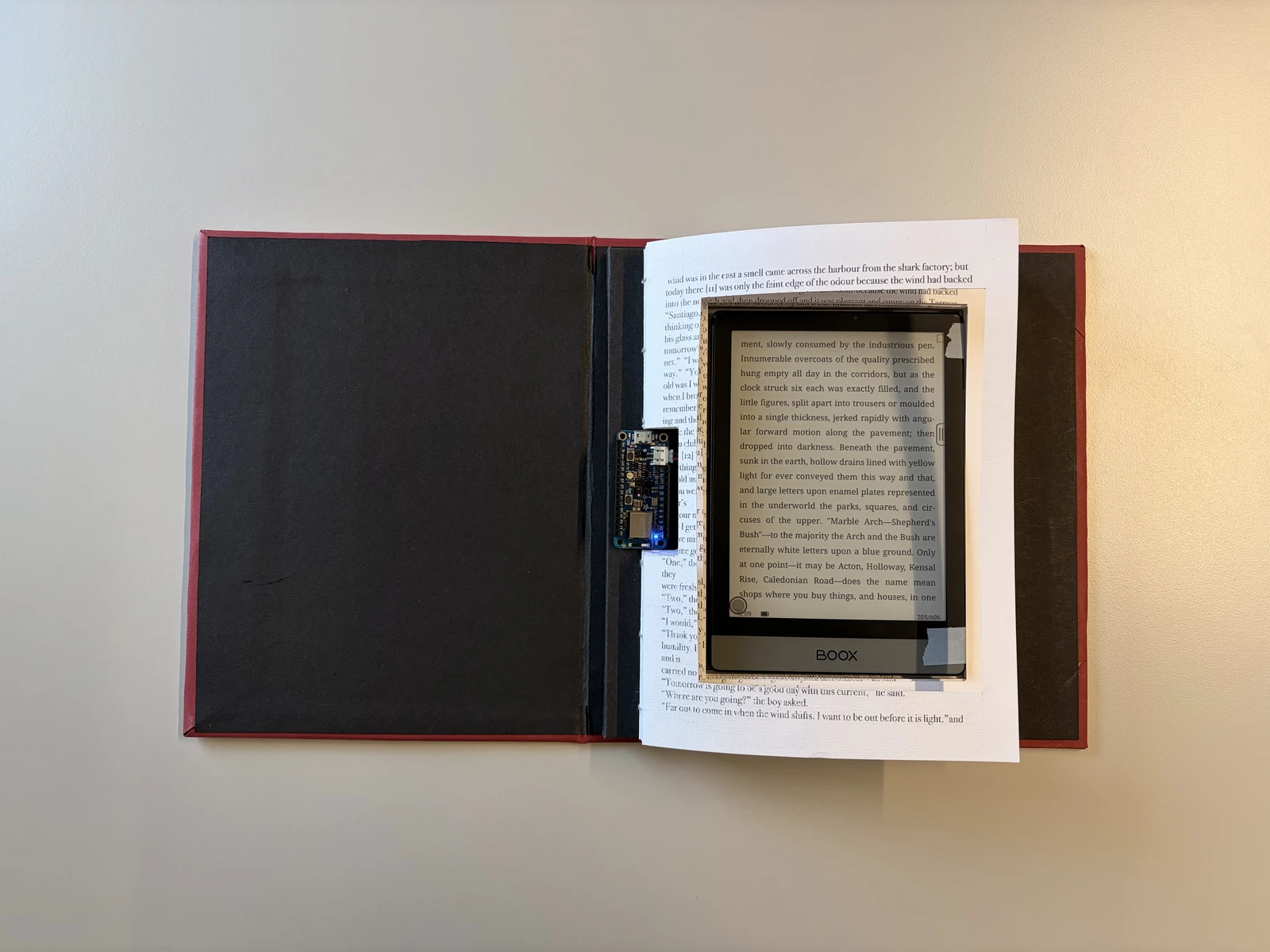
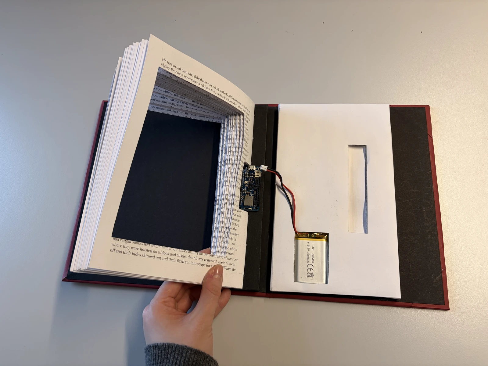
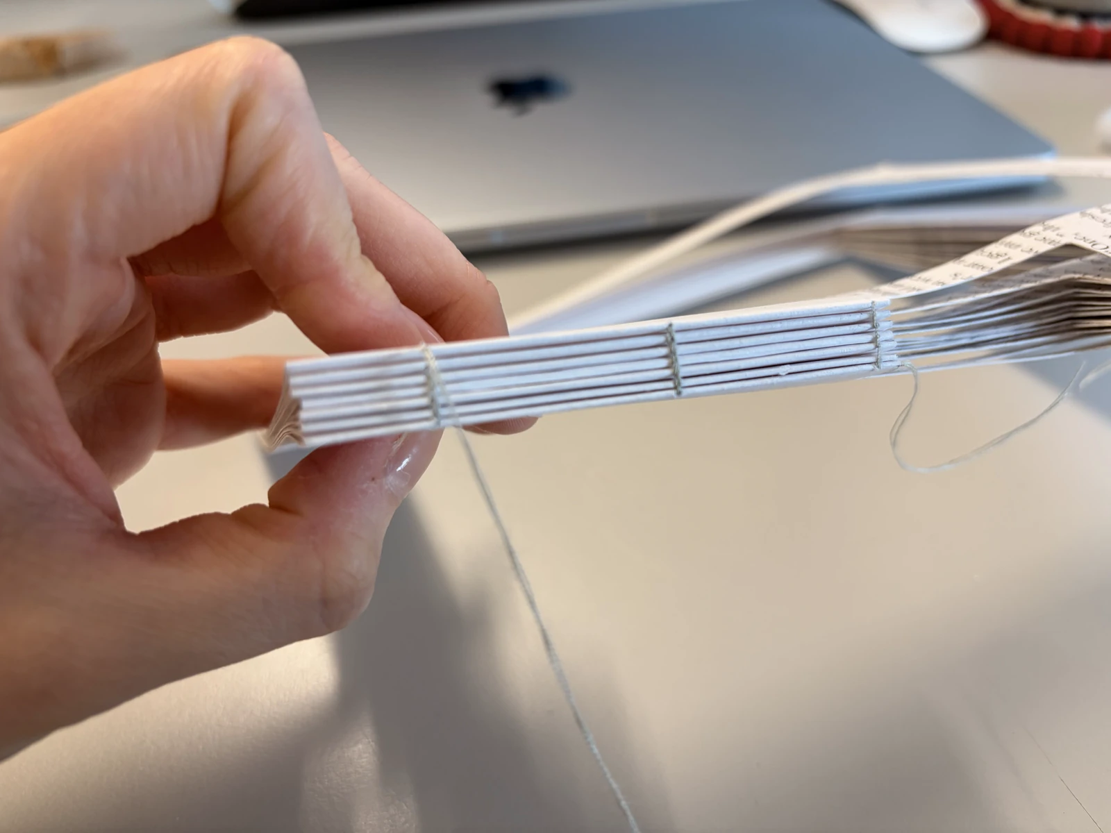
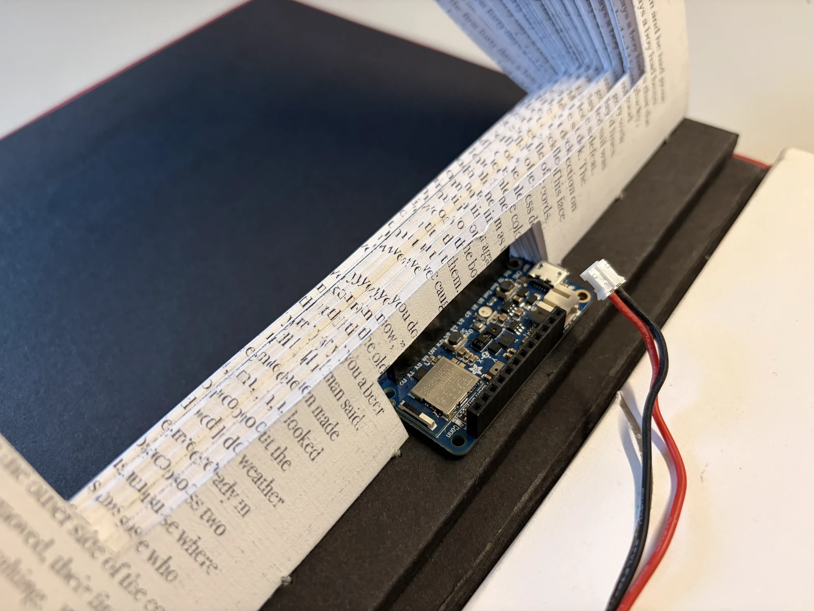
This prototype turns a physical book into a remote control for an ebook reader. Since moving to Sweden I have read only ebooks, and I began to miss the texture of paper and the interaction of turning a page. I made this to see whether that feeling could be emulated while still reading on an ebook.
First test
Check sensor with a hand
The idea was to use the proximity sensor built into the board. The first test is to connect it over Bluetooth to my ebook reader and check how responsive it is.
Second test
Use paper & copper tape
I needed to check whether the proximity sensor could detect paper moving. I also used copper tape to make it more responsive.
Third test
Put ebook inside the paper
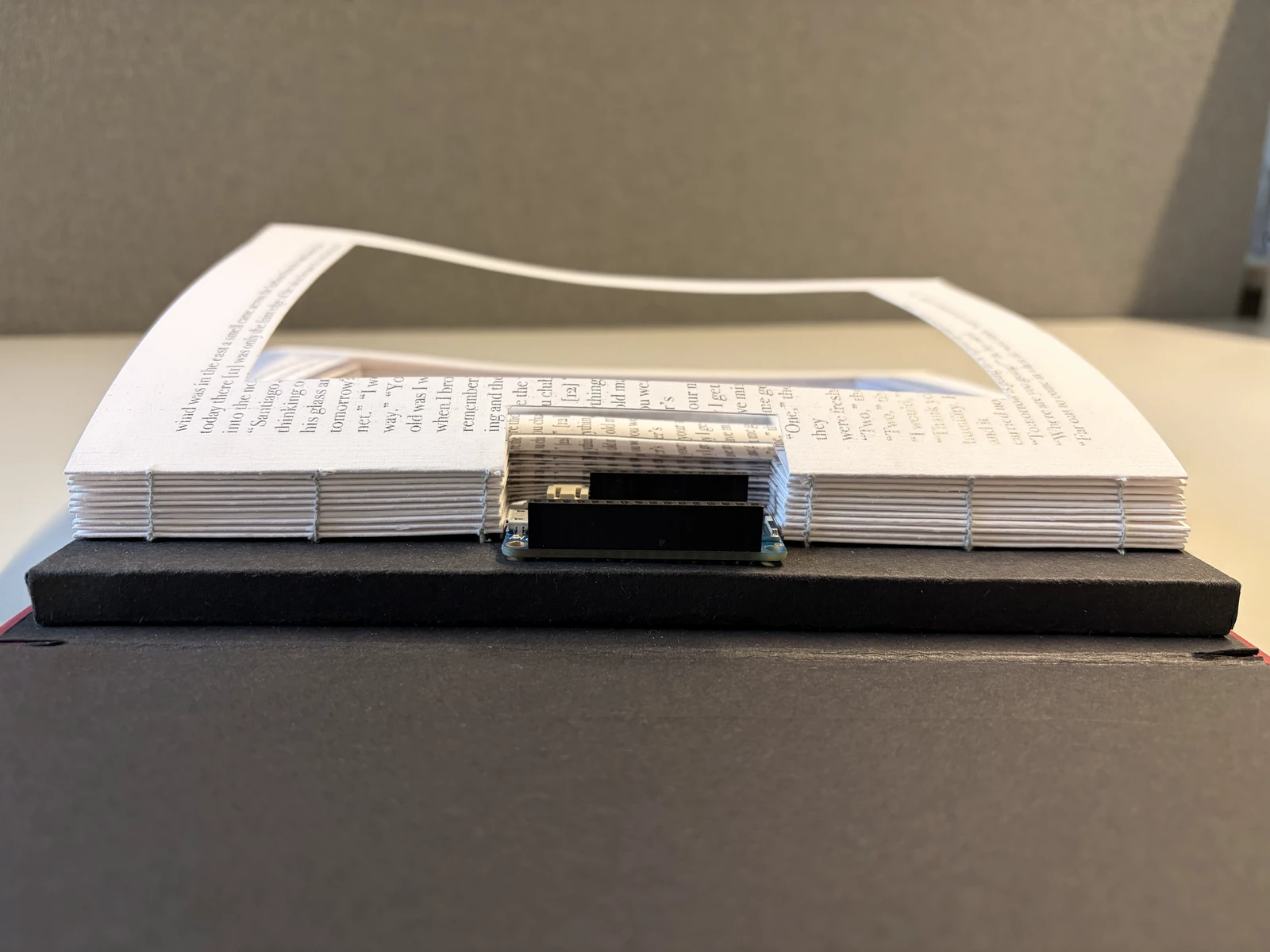
Rather than keeping it separate, like a remote control, I wanted to put the ebook inside the physical book. So I built a temporary spine to hold the Arduino Feather, cut out the paper to make room for the ebook, and tested the sensor again. At this stage I also calibrated the values more finely, so it stayed responsive enough without copper tape.
Final test
Testing with a physical book
Final calibration and sensor testing before I make the physical book.
Code
The code behind it
#include <bluefruit.h>#include <Adafruit_APDS9960.h>BLEDis bledis;BLEHidAdafruit blehid;Adafruit_APDS9960 apds;// ↓ How far above the resting value counts as a "page turn"const float JUMP_ON = 25; // baseline + 25 or more → turn detectedconst float JUMP_OFF = 10; // back down to baseline + 10 or less → ready againconst unsigned long COOLDOWN = 700;float baseline = 0;bool armed = true;unsigned long lastTurn = 0;void sendKey(uint8_t keycode) { uint8_t keys[6] = { keycode, 0, 0, 0, 0, 0 }; blehid.keyboardReport(0, keys); delay(20); blehid.keyRelease();}void setup() { Serial.begin(115200); if (!apds.begin()) { Serial.println("APDS9960 not found"); while (1); } apds.enableProximity(true); // Maximize sensor sensitivity apds.setProxGain(APDS9960_PGAIN_4X); apds.setLED(APDS9960_LEDDRIVE_100MA, APDS9960_LEDBOOST_300PCNT); apds.setProxPulse(APDS9960_PPULSELEN_16US, 16); // Measure the resting value at startup (keep paper away from the sensor during this) for (int i = 0; i < 50; i++) { baseline += apds.readProximity(); delay(10); } baseline /= 50; Bluefruit.begin(); Bluefruit.setName("PaperBook"); bledis.setManufacturer("Eonbi"); bledis.setModel("PaperBook"); bledis.begin(); blehid.begin(); Bluefruit.Advertising.addFlags(BLE_GAP_ADV_FLAGS_LE_ONLY_GENERAL_DISC_MODE); Bluefruit.Advertising.addTxPower(); Bluefruit.Advertising.addAppearance(BLE_APPEARANCE_HID_KEYBOARD); Bluefruit.Advertising.addService(blehid); Bluefruit.Advertising.addName(); Bluefruit.Advertising.restartOnDisconnect(true); Bluefruit.Advertising.start(0);}void loop() { float p = apds.readProximity(); // Compare two traces in the Serial Plotter: current value / baseline Serial.print(p); Serial.print(" "); Serial.println(baseline); if (armed) { if (p > baseline + JUMP_ON && millis() - lastTurn > COOLDOWN) { sendKey(HID_KEY_ARROW_RIGHT); lastTurn = millis(); armed = false; } else { baseline = baseline * 0.98 + p * 0.02; // slowly track the resting value } } else if (p < baseline + JUMP_OFF) { armed = true; } delay(5);}
Final prototype
Detail images
Reflection
Sense of building anything I imagine
Through these projects, I practiced to code with AI more and to work with electronics. Making something I could hold in my hands let me focus on execution, and it was great fun. What stays with me most is the sense that I can build anything I imagine. I think that sense will be a great asset in the projects ahead.
This exploration focuses on improving the search tab of the music app 'Vibe' operated by Naver Corporation in South Korea. I imagined three possible features that can support users to explore and create personalised music in a more engaging and enjoyable way.
Experience
Nov – Dec 2021
UX Design Intern
Place
Naver Corporation
Interaction
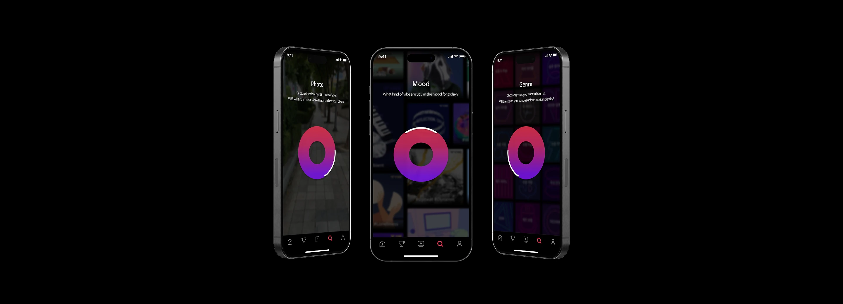
Activating features with wheel interaction
All three features sit on one wheel in the search tab: turning it moves between Mood, Photo and Genre. The interaction is part of what is being explored, rather than a way through to it.
Feature 1
Personalised mood board
A feeling is often easier to describe in images than in words. The Mood feature lets a listener pick images to build their own mood board, and gathers a playlist from it.
Feature 2
Capturing the view
The Photo feature finds the music that fits a photo taken on the spot, and suggests other songs close to it.
Feature 3
Customising genre mix
A playlist is rarely one genre. The Genre feature builds one from several at once, and how much of each goes in is a choice rather than a default.
Reflection
Experience of working within a small scope
I aimed to explore different type of interaction and features that enhance user-experience while aligning with Vibe’s identity as a personal curation music app. Even though this concept is still in the early stage of ideation, it was a good opportunity to deeply consider user experience within a smaller scope of the digital service.




 Team
Team